Wednesday, July 30, 2008

Wednesday Inspiration - happy birthday

Happy Birthday to you! I'm absolutely surrounded by birthdays in July/August/Sept (--11 bdays for my family only!), so let's explore the digital world of birthdays this week!

Can't call 'em freebies, too many have a price on them.
So this week, we'll call 'em

Birthday Affordables:

at ScrapStreet.com:
ScrapStewSue's Birthday Odyssey for ScrapStreet.com


Fonts:
Dafont.com: Birthday (#s 0-9 only)
Fonts.com: Birthday page
UrbanFonts.com: BirthdayGreetz
SeachFreeFonts.com: Birthday page

Brushes:
Mel's Brushes: Birthday
Andrea's Brushes: Birthday

Quotes & Titles:
Scrapbook.com: Birthday quotes & phrases
Scrapbook.com: Birthday titles
ThePerfectTitle.com: Birthday theme

Odds & ends:
ScrapGirls: Birthday Wishes
ScrapGirls: Birthday Card Sentiments
Daisie Company: Birthday ClipArt

Want to try the layout above? Please don't feel confined to the shapes in the sketch - they're just a supply guide and used to fit the theme today! ;-)

Tuesday, July 29, 2008

Printable Calendar in a Jiffy

There's times that I need just a calendar month page in print and this is the perfect place to make one when I'm in a rush. Here's the 3 steps that's fast and oh so easy!
  • Select the date and calendar type (week / month / year)
  • Select an image and text
  • Press the 'Create Calendar' button!

Monday, July 28, 2008

A Whole New Look!

Hey we all like a new outfit or spruce up something we already have around and customize it to our own look.
I am so excited I have a whole new look for my blog!!! I have be admiring the blogs with the fancy headers and sidebars that all match. I had figured out how do my own header for my blog but I had no clue how to do the sidebars. So the other day I was going through the forum at DST and came across Shabby Miss Jenn's shabby blogs.Photobucket
These have all the elements already done for you but I was still not ready to take the plunge because I still had no idea how to get these into my blog.
I found some other cute kits with the same concept the one difference for me which brought me back to buy from Shabby Miss Jenn was she has a tutorial already setup that walks you through the whole process of how to get this into your blog. So I watched the tutorial video and thought I can do this!!
So Saturday I took the plunge and bought the kit. It took me about 2 hours to get everything set up, I had to customize my header and the sidebars to say what I wanted on them. Then began the setup, with the video tutorial you can watch it and then stop it to do what you need to do.
Photobucket
Believe me if I can do it anyone can. So go fancy up your blog as there is nothing standing in your way now. If you want to stop by and see how the whole blog looks as the picture only show part of it come on by to Eyelet's Scraps Designs.

Sunday, July 27, 2008

Word Play

As an English professor in the non scrapping world, words are my passion. I love searching for the right words for my title, my journaling, my writing. And when reading my favorite scrapbooking magazines, the layouts that never fail to catch my eye are the ones that use words creatively.

A friend sent me a link to Wordle this week and I spent more time than I want to confess playing and creating "word clouds." Fonts, colors, words, shapes--it will mix them all up for you! I put in the link to our journaling blog and here is the cloud Wordle created for me. Cute, right?


I have been a fan of Anna Aspnes' word art since the first time I ran across it in a gallery. The current issue of Digital Scrapbooking has a fabulous layout titled "Happiness" on page 49. It is basically word art and a photo and it ROCKS! I was so inspired that I tried my own hand at a "word art only" page. Ok, so I had to put a smidge of paper on, but you will forgive me, right?

Have fun and play with some words today!


Dance by Dora Phillips. Supplies: Word Art: Children by Anna Aspnes, Paper: Jessica Sprague's Flower Girl, Stitching and Staples are my own.

Friday, July 25, 2008

Celebrating- Coupon for You

I am celebrating 35 years of marriage on July 27th and wanted to extend my celebrating to you. I have slashed my store 35% plus here is a coupon for $3.50 off an order of at least $10.00, which means you end up getting a kit for free. So don't miss out!!

Click the coupon to take you to the store or click here

Photobucket

Do you know Etsy?

It is my new addiction. Where I used to pop onto flickr when my mojo was running low, now I race into Etsy. What is Etsy? An online mall for homemade yummies and crafty goodness. A really wonderful place to get the heart pumping.

Looking for some color inspiration? You have to try the Etsy color page! Click on a color and it shows the items for sale in that color. Click on those thumbnails and you can twirl and fling them around the page. Pretty soon you will have a collection of inspiring color matches to get you in the mood to create.

I have two faves this week from a color combo that I rarely use, but am now madly in love with:


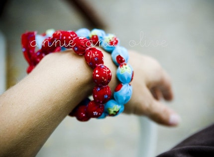
The bold red, the bright blue, a hint of apples--I am already reaching for my sketch pad to start a back to school kit that will POP!

Hope you find a little mojo today the Etsy way!

Thursday, July 24, 2008

It's A Mistake....

It's a mistake we often cry, an error! We generally learn by making mistakes; small and frequent when we are younger, bigger mistakes, but not so often as we grow older. They cannot always be avoided so we may as well live and learn.

Here are some quotes for you to think about this week...all to do with making mistakes!

Experience enables you to recognize a mistake when you make it again. - Franklin P. Jones
I never made a mistake in my life; at least, never one that I couldn't explain away afterwards. - Rudyard Kipling
If you can't make a mistake, you can't make anything. - Marva Collin
I have made mistakes, but I never made the mistake of claiming that I never made one. - James Bennett
Every great mistake has a halfway moment, a split second when it can be recalled and perhaps remedied. - Pearl S Buck
All men make mistakes, but only wise men learn from their mistakes. - Winston Churchill
I love fools experiments. I am always making them. - Charles Darwin
Even a mistake may turn out to be the one thing necessary to a worthwhile achievement. -
Henry Ford


So off I go to make my next mistake..... see you next week!

Wednesday, July 23, 2008

Wednesday Inspiration - i'm lost, point me out?

I am infatuated with road signs. Every where I look (or turn, as the case may be), I am always actively noticing road signs.


Here's the story: When I was little, we were an often-traveling Army family. Mode of transportation was, of course, car in the United States, twice across the United States. Dad told my brother & I this story - The Story of Falling Rock. He was a young Native American boy who had gotten lost amid the mountains. So it was my brother's and my job to look for young Falling Rock as we drove across the U.S., especially when we saw the watch for falling rock road signs.


Once I realized the magnificent and slightly genius ploy behind Dad's story, I still realized my eyes were ever watching road signs. Arrows, colors, directions, you name it - I'm watching it.


Oh, don't even get me started on my obsession with studying traffic patterns. Doug can fill ya in on that one. =)


So, why not some arrow freebies (or almost free)?


ARROWS:
dafonts.com: Pointers
dafonts.com: Polywog
Myfonts.com: Arrow Fonts
Graphicxtras.com: Arrow Fonts


Vectorstock.com: Arrow brushes
Seishedo (symbolical): This Way Out


FishTanked by Lindsey Krauss. Supplies: Digital kit: Relax by Michelle "Spink" Boeckermann for ScrapStreet.com, Fonts: 2Peas, Editing program: Adobe PhotoShop CS2. Lure, Googled. Sketch: Scrapbook and Cards Today, 2008.

Tuesday, July 22, 2008

Pop A Color

I loved this photo of Brooke, but the color of her coat overwhelmed the detail of the butterfly on her hands.
Here's a super simple way to take a color photograph and highlight a key element as the focal point.


1. Open your photo and duplicate so as to preserve your original.
2. Now click Hue/Saturation in your layers palette and move the slider to the left to -100.

3. Make sure your Foreground colors are in their default position of Foreground=Black and Background=White.

4. Go to Edit and "Fill" your layer mask with white.

5. Select a soft round brush with black as your foreground and begin to add back the colors you want in your photo image by simply brushing over. Don't forget to zoom-in to be as accurate as possible.
6. If you make any mistakes such as "over the edges" not a problem, just reverse your brush color to white and clean up any errors.

I added another touch to this photo using Alien Skin Exposure.
I chose "Color Film" and then chose...Modify>Soften>Subtle to get a bit more of a dreamy effect.


Finished Photo


Monday, July 21, 2008

Colors of the Rainbow

Photobucket
I was out in a bad storm last week but by the time we were almost home the most beautiful rainbow appeared. I hadn't see a full one in a long time and it was so vibrant. By the time we reach home I was able to get a picture of it before it faded completely. So I just had to share it with you since I am going to tell you about a wonderful color-picker program.

The past two months have been an adventure in computer issues. My laptop died about 2 months back and I thought there was no hope for it. So I have been borrowing a computer so I could continue to design. Well as anyone knows when your computer crashes or just down right dies you lose everything you haven't backed.
I was been pretty good at backing up everything on my EHD but I never thought to backup my favorite web links. The ones I go to everyday (like ScrapStreet) I know by heart but there are tons that I didn't remember. So along with working with a computer that is not mine I had to research out those favorite places again.
On one of my researches was for a Color picker as this is a great resource in designing kits. I found some but I was not happy with them, but finally I found COPASOPhotobucket

It has all the features that I like in a color-picker program plus as a bonus it is free. I am still learning it myself so I can't really demo it for you but there is a wonderful video demo on the web site that you can check out.
So two things I learned out my computer experience not only have your files backed up but somewhere you need to have a copy of all your favorite sites.
Now the good news is that the computer I thought was beyond fixing wasn't!!! Yeah, I just got it back last week from being in the hands of computer geeks for 3 weeks. Turns out it was a bad stick of memory, we popped out that baby and replaced it now we are as good as new. Best news of all was it only cost me $25.00.
Have a Great Day and Backup you system today!

Sunday, July 20, 2008

Sunday Exhaustion!

Happy Sunday all! Sorry to have missed chatting with you all on Friday--I was off at CHA enjoying being all wrapped up in scrappy goodness. What a sensory overload it is to see all of the new scrap items all in one space! Layouts, projects, papers, and goodies are everywhere. As a hybrid scrapper, I have the joy of both worlds. I loved seeing digital designers names on some yummy paper scrapping lines. It is fabulous to see how well designed they really are and how fun it is to see them glittered, flocked, raised on traditional paper.

But what was the most fun was seeing so many "imaginary" friends come to life. My son is pretty sure that mommy's computer friends are just the same as his imaginary ones, living just in my mind. But CHA was a festival of friends! Not only did I meet up with the gals we knew were going to be there, but we had a bit of time to be starstruck by meeting some talented ladies who we admire online.

Here is a shot of us as we roamed around yest:


Now I am off for a nap and then to dive right in with my scrapping! I am soooooo motivated to finish up a freebie for all my blogging buddies and scrappy friends before I start using up all my current supplies to make room for my new stuff.

Have a super scrappy day!

Saturday, July 19, 2008

Hey hey it's Saturday

Another week gone by already, half way through summer and my feet haven't touched the ground yet. Our local weather here in the Uk and Wales in particular is warmish, cloudy with rain. It always rains in the valleys of Wales, it's why they are so lush and green. we grow good lamb here as well as the rare Black Beef. There is a local butcher who butchers his own cattle, and we get wonderful fresh meat from him. along with a variety of beef sausage that he makes to his own recipe ummyum.

From here at home we have a view over the Amman Valley and over the otherside of the mountain we have the Towy Valley, We live at the highest point around these here immediate parts. How do I know this, well the signal mast for the whole of West and South Wales is just at the top of the road. You can see that mast for miles and miles away.

On a note for scrapbooking, we went to the BigPit coal mining museum. It was up until recently a working mine, but went the way of most of the mines in Wales. Redundant.!! However they spruced it up added bits for a visitor centre and opened it up to the public.
You get a film show giving you the history of the pit and mining in general, then you get kitted out with hard hat and lantern and you are taken down the mine shaft in a cage and taken round the tunnels. Absolutely fascinating.
You can see where they stabled the pit ponies, who never saw light of day and went blind because of the darkness, saw the medical room where sick or injured miners would go and take a lie down.
Young children had worked down there too, in this darkness, they would open and shut the doors for the miners to come through with the coal trucks. This would be there job all day, if they had a candle or light there they would be lucky and if it blew out they were in total and I mean total darkness.
When we got to the end of the tour they turned out the lights to show us how dark it is down there. Really it is total darkness, you cannot tell up from down and your sense of balance is disturbed. You have nothing to orientate yourself with. Truly you cannot see your hand in front of your face.

It was a very fascinating place to visit, I wanted to take photos to scrap, but we were not allowed to use cameras i n the mine tunnels for fear of explosive gases. When we came out it was predictably dark and raining cats and dogs so not even a photo of the outside.
I hope to go back there and take photos of everything outside, Go and see where the miners had baths when they finished. Most would go home in the 'black' as they call it.
This has been a very successful enterprise for the mine. It gave the miners chance to retrain, so instead of being out of work they had the opportunity to become keepers and tour guides of the mines. Brilliant tour guides too as there is nothing they don't know about the way things were there.
All of this and it's FREE. All museums are free to visit in Wales.
Hope you have enjoyed this slightly different take on the saturday blogpost. Will be back next Saturday with some new kits being released soon as well as highlights form around the forums and Galleries at Scrapstreet
For a little treat for you here is a small gift from Sue Wood Designs at Scrapstreet

Thursday, July 17, 2008

Thursday Thought - The Journey

So Thursday again. It is late pm for me to post this where I live, but still early in your day across the pond in USA!

I am late because I went on a journey....2 hours to go and 2 hours to come back. Not a journey I had chosen or somewhere I wanted to go, but a journey to accompany someone I love..a journey for them.

I got to thinking about the different journeys we do in our lives, the small daily ones, the special ones, the sad or happy ones. I thought it might be good to scrap a journey, so here are some quotes to get your inspiration moving:

The journey of a thousand miles begins with one step. - Lao-Tzu

A journey is best measured in friends rather than miles. — Tim Cahill

Life to me is a journey - you never know what may be your next destination. - David Russell

The world is a book and those who do not travel read only one page. — St. Augustine

There are two classes of travel: first class and with children. — Robert Benchley

It is not the destination that is important in this life, but the journey - Unknown

I wish you a very good journey to an unknown you've never seen - Pieter V Admiraal

Here is a small freebie from me...some word art you can use on your LO!


Click here and enjoy your journey!

Wednesday, July 16, 2008

Wednesday Inspiration - carnival rides

I don't know about you, but summer around here is the season of carnivals. There is one every week in every town and they seem to travel all around our county until the true county fair. So let's get you ready for your carnival photos!

Here are your carnival-type (or similar theme) freebies this week:
**dafont.com: Carnival


Here's how I did it:

Tuesday, July 15, 2008

Texturing Photos

Your Digital Scrap book papers are not just for scrapping. Many professional photographers have taken textures to a new level and so can you by simply adapting some of your background (textured not flat) scrap papers onto your photographs. Depending on what look you want to achieve, the sky's the limit.

The process is simple enough so below are the basic steps. Feel free to experiment along the way. I find that the more subtle your effect is the better it looks in print. I have over exaggerated this image so that you get the idea. My objective is to give this image a vintage vignette look and feel for a card-making project.

1. Open your photograph
2. Open a digital paper with texture of your choosing.

3. Now copy and paste your digital background paper over your photo.
4. With your background layer selected, start to play with your Blend Modes in the layers pallet. You can scroll through your options with your down arrow key.
5. Lower your opacity but don't worry about your subject being textured. That's the next step.
6. With a soft brush, erase over all the areas that you don't want texture on, like faces, arms, etc. In the example, I've erased the texture from the flower.
7. Next go to your Adjustment Layer and select Hue and Saturation.
8. Move your sliders around until you get the look you want or leave it as is.
9. That's pretty much it unless you'd like to use the Burn and Dodge tools on your edges.
If you'd like the flower photo in high resolution you can grab it here. It's one of mine taken in early spring of a wildflower.

If you would like to see further examples of this technique by well known Professionals, here's a few links.
Jess De Rox
Nicole Van
Red Leaf

Monday, July 14, 2008

What's Your View Point?

Are you stuck in a photography rut and take your pictures all from the same angle or view point? Try mixing it up the next time you have your camera out on a photo shoot or just taking pictures of your family.
Here is an example of what I'm talking about, I took this picture on one of my early morning walks. I was just taking random pictures of interesting things as I was going along. I wanted to try taking some shots from different view points. Now I didn't really know what I had until I got home as it was such a bright sunny day that with the digital camera I couldn't see the viewer on the camera. So I was really excited how this one turned out it!
Photobucket
I did add a filter to it but I think it was still a stunning view of the world from an angle we don't usually see. And now you can see the finished product of it in a completed layout.

Photobucket
Here is another example of a different angle to take a pic from. In this one I was holding the camera and the baby at the same time. I wasn't going to get left out of the pictures anymore so I was doing this one myself holding my newest grandson. Now of course I couldn't really see how it was going to come out so I was just taking random shots and checking after the results after.
PhotobucketPhotobucket

I hope you are beginning to see what you can do by changing your point of view or level from which you are taking the picture.
Try getting down on their level as in this picture of my puppy. This shot wouldn't have looked Photobucket
same if I had taken it standing looking down on her. I got up close and personal, don't be afraid to get up close often times we are to far from our subjects. Experment with your camera and the settings to see what you can come up with. I love my digital camera because I'm not afraid of blowing a whole roll of film and nothing coming out. I can see just what I have as soon as I take the picture.
I challenge you to get out there and see the world from a whole different angle today.

Sunday, July 13, 2008

Sunday, love to learn

I love learning new things! I just cannot help it--the teacher in me just loves to learn anything and everything. Often, I get lost online researching new things. This week, it was solar panels and typography. I know that they have absolutely nothing to do with each other, but both caught my eye this week.

Although I am sure you are dying to know all about my plan to gradually move my home to solar energy, but what I want to share with you today is a cool typography site. http://ilovetypography.com/ has so much wonderful information! Everything from how to make your own font to the history of fonts can be found here.

Give it a peek and a bookmark.

Saturday, July 12, 2008

Hey Hey It's Saturday

Well it's Saturday again..yippee. time for a couple of hours to do the things I want to do. One of those things is to write you this blog post. Thought we might have a look at a few design tips. For those of us who like to try our hand at designing there are a few tricks we have all learned along the way. I found a really excellent little way of getting rid of those 'flying pixels' we all have from time to time. Yes I know we know how to find them, but what about when we have found them how do we get rid without ending up getting dots in front of our eyeballs?


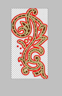
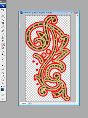
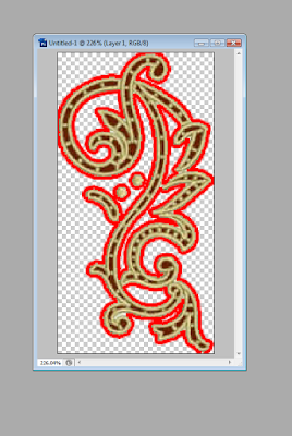
Well once you have found your strays (by using stroke in styles when using ps to highlight the strays) Find the eraser and choose the third option of magic eraser. Using this tap once or twice in an area outside your image. Notice the red stroke narrowing, if needed repeat the same until your strays have gone. this is especially useful for large and complicated 'cutouts', If there is only one or two strays then using the eraser is probably quicker, but the way explained is ideal for delicate work and for getting in to tight areas.


highlight the strays with stroke


choose the magic eraser then click on empty pixels in canvas


Your image should now be flying pixel free. Now cancel the stroke.

Here is a word of caution though, if the edges of the original image were feathered at all, this way of dealing with straglers will not work. AND always keep a duplicate of your original work so that you are not disappointed if things did not work out the way you wanted.

To finish up your image you may need to select and modify by 2 or 3 pixels contractedand or smoothed, then invert selection and clear Clear the stroke too.. Hope this is of use to you all. Let me know through the comments any tips you have found or have for us to shortcut otherwise labour intensive work.

Friday, July 11, 2008

Dare you!

I would consider myself to be fairly techno savvy. I have to think all digi scrappers would fall into the computer-do as opposed to the computer-don'ts. That is not to say that there are not times when we want to chuck the little beastie through a wall, but we take a deep breath, pop some chocolate in, and try again.

right?

So why is it that none of my non computer devices have any layouts on them? Or even any pictures?

My phone. My mp3 player. My hubby's mp3 player. His phone. My daughter's mp3 player. The rotating digital key chain thing my MIL gave me for Christmas. Not last Christmas--the one before that. Not a single one boasts an image of my children in all their scrapbooked glory.

We were at dinner with friends and doing the inevitable show pictures of our munchkins. I had a few in my wallet. Everyone else had them stored in phones. Darling. Best I could do to keep up was to use the hubby's blackberry and zip into my ScrapStreet gallery. whew. good thing I had that for back up!

So here is my dare today. Grab your electrical friends and load them up with some of those pretties you work so hard to create. You can do it! The computer is your friend!

Who knows. You may just want to run an extra mile during your workout while looking down at that layout made from you in your bathing suit at 18. Try combining it with some inspiring song like "Eye of the Tiger" or my current fave Trace's "One Hot Momma."

smooches!

Thursday, July 10, 2008

Thursday Thoughts - Have a bit of Heart

So Thursday again........ I have been musing that in this day and age it is easy to be busy and overlook the little things, a kind word here, a helping hand there. All the little gestures that show your heart.

We all have a heart, which is essentially a circulation pump, but that is not how we think of it or draw it. Your heart is an essential part of who you are and whilst the eyes may be the window to your soul, perhaps the heart is it's home?

So a few quotes about hearts for you to think about this week.


"To live in hearts we leave behind is not to die." Campbell

"Words are the voice of the heart." Confucius

"Among the things you can give and still keep are your word, a smile, and a grateful heart." Zig Ziglar

"Beauty is not in the face; Beauty is a light in the heart." Kahlil Gibran

"Wheresoever you go, go with all your heart" Confucius

"A gentle heart is tied with an easy thread" George Herbert

I promised a freebie this week, so here are some hearts to decorate your scrap pages and maybe do some journalling with.


So if you want a heart, download my Heart Freebie here

Wednesday, July 9, 2008

Wednesday Inspiration - gaining independence

We just celebrated Independence Day on the 4th of July here in the USA and it's everything stars and stripes and red, white & blue. So we're going there and to the fireworks show in this week's inspiration. I know ya got a lot of those pics to scrap!

Here's what I found:

*
*
*
(look under
'starful')

Click this gorgeous kit for your fourth! Available free maybe for a limited time only!


Looking for some title help? Found a few you might put to good use:

  • America the Beautiful
  • American Pride
  • Every Heart Beats True
  • Explosion of Fun
  • Fireworks On The Fourth
  • God Bless America
  • Lil' Firecracker
  • Proud To Be An American
  • (anything) Red, White & Blue
  • Stars & Stripes Forever

Oh, so you say you want another ScrapStreet Designer freebie? Okay! Here ya go!! Click the ribbon balloon for a free Sue Wood Designs' STRIPEY ALPHA download!

Tuesday, July 8, 2008

Font Find From Ronna Penner


This weeks fabulous font find comes from Ronna Penner. It's a free download offered through Matter of Scraps newsletter. The font is simply named Journaling Hand. Ronna describes it this way;

"I designed Journaling Hand with scrapbooking in mind. It's kind of unusual with it's long ascenders and descenders, so give lots of room between the lines of type (leading). Journaling Hand is a quirky handwriting typeface and it will lend an unconventional look to your journaling. Enjoy!"

If you like this font, Ronna offers more of her fantastic fonts at My Fonts and also at her own website, Typadelic where she is currently offering five other free font downloads.

Monday, July 7, 2008

Texture Fun

I went on a walk in this fab park we have, it is full of flowers, fountains and a greenhouse. Last time I was there I took some wonderful pictures of flowers that I used on my cards I make. This time I really got caught up in looking for pictures of textures which I could later use in my designing.

So I thought I would share two of the textures I took and show you what I would do with it. It can been fun even if you aren't a designer to try this for yourself.

I went in and picked a color that I wanted to work with as my starting background.
Photobucket

Now I wanted to get a texture that I would place on top of this --
Photobucket
This texture started off as tree bark which I liked but wanted to try something a bit different with it. So I took the whole picture and scunched it up and then copied and pasted a few times to come up with the texture at the top. I then blended the seams a bit with the blur tool.

Now we are to go to the blending tools as see what we can come up with.
Photobucket
I circled the blending tool so you can see on this one I used "Hard Light". While this is an interesting texture I'm not done playing with this yet. You could lower the opacity to make the texture lighter or leave it like it is. I want to leave it at 100% but I'm going to add another texture on top of this one to show you what you can do.
Photobucket
I love this grungy looking stone texture that I took, so I am going to place this on the layer above the texture we had been working with. Then I am going to go to the blending tools and use the, "Linear Burn" on this texture layer.

Photobucket

Now the paper is getting really interesting but let's play around with the blending tools as I'm not sure I want to leave it like this.

Photobucket

Oh, now I really liked how that turned out and I think I will leave it just like this. I love the grunge look of this paper and ideas are popping in my head for where I could go with designing a kit using this paper.

If you would like to try having some fun with textures I have a few free ones for you. These can be used for personal or commerical use. I hope you enjoy them and have fun creating.
Photobucket

http://www.4shared.com/dir/8132949/1b664335/Free_Textures.html

Sunday, July 6, 2008

Dare you to look differently today!

What grabs you most when you are wandering around? Color? Texture? Lines? What is it that you see first?

My eye goes to lines first--shape, pattern, outline--which is probably why I sketch as often as I do. Today I decided to zip around flickr really quickly letting color catch my eye instead. I found myself drawn to bold and bright ones layered together, which totally fits my mood today. My family is off for a day at the carnival and I will be working to capture my day in color!

I dare you to give seeing the world a new way a try today. If you are usually a color person, then swap with me and try looking at the lines in your corner of the world today. Who knows what amazing photos we will all create today!

Here is a favorite color inspiration for me today:

Saturday, July 5, 2008

Hey Hey Its Saturday

Well if there is one day in the week when most folks think they have some 'me' time it's Saturday. so come on in, with your tea coffee or coke not forgetting the pepsi fiends among us, and settle down for a little gossip and chat from the scrapping world.


You know Scrapstreet is constantly evolving, the magazine is including new articles, the familiar columns are there along with several new ones and of course everyones favorite the free kit is still available once a month.


This month it is July Jeans designed by Dora Phillips and Michelle Boeckerman. It is a fab mixture of holiday colors just right to inspire layouts for your 4th July photos. Have fun with it. I know Dora and Spinks would just love to see the layouts you make, and you stand a very good chance of having your layout featured in the magazine in the coming months.


Our new designer Scrap Stew Sue has been adding a great deal of variety to the products available from SS store, take a look too at Katey Green of Handmaid Fame's new offerings too. All reasonably priced and just perfect for your next photo album page.
Below is an example of the variety of items ScrapStew Stew brings to ScrapStreet.
Sparkle Pack by ScrapStewSue


Katey Green's Le Mariage


Want to have a bit of a giggle and catch up on life in the Scrapstreet lane? You can't miss the fun and want to join in on the lively Life Lane Topic on the forum boards.


Saturday Night is always a fun night at Scrapstreet. If you enjoy scrapping and chatting online then come along and visit the boards here at Scrapstreet.
So long for now my sweeties.

Friday, July 4, 2008

Welcome to Friday!!!!!!!!

I confess. I am a sketcher. Before I write anything, I jot down a few notes in the margin--an outline of sorts. Before scrapping, I do the same thing. I put at least the basic bones of my layout into a margin. My sketches never seem to have embellishments on them, but they start me off with a shape I can translate into a finished page or two. I jotted this one down on my napkin this morning as I was setting up our neighborhood penny carnival. What inspired me? Their were three picnic tables all in a row in the corner of our park pavilion. I saw this:


And when I got home, I digi-ed it up and then grabbed a couple of pics from today and got right down to playtime. Yes, you read right--I scrapped today's pictures today! Just a couple from my VERY full camera!


1st Taste by Dora Phillips. Model is my darling niece Isabelle who became a big sister yesterday! Kit is Puckered Place my new fave of mine available in our store.


Pimped My Ride by Dora Phillips. Kit is July Jeans free this month in the ScrapStreet store.

What can you do with this sketch? I would love to see! If you make something you would like to share, email me at dora@scrapstreet.com. Happy 4th of July!