Monday, April 30, 2012
May I?
Welcome to May! Today we have our mini mag all ready for you. We are so happy to share pages by our talented and amazing designers. Our readers are wonderfully talented and we love showing off their work every month. Take a peek at this issue:
And, of course, this issue comes with a free digital kit. Our own Katey created a kit that is more than just perfect; it is pure Bliss.
Download Links: {one} {two}
Please respect this generous gift and do not upload/share this kit. Friends are welcome to download it here for the next month. Thank you!
We hope you will join in with so many talented scrappers and share your art with us this month. Take a peek at our calls and send in your creations.
You Have My Smile
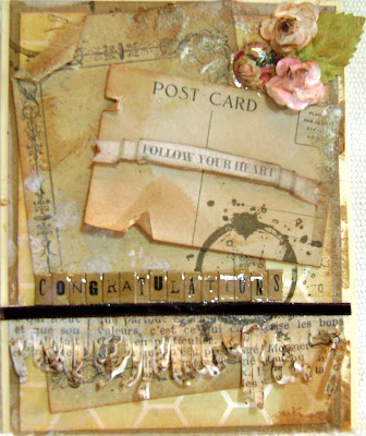
Now to the layout, I used an electic array of paper and techniques. One of "go to" techniques when I design is to layer. I love to layer and give depth to my work. I also used acrylic paints, glimmer mist, distress inks, glossy accents, silk paints, stencils and stamps.
Because I had plenty of extra ... I also made a card. Hope you enjoy :)
Sunday, April 29, 2012
Time for a Coffee Break!
I finally decided to dig out my Cricut Expression. I have to admit, it was covered with a mighty huge layer of dust. But what's worse is that I even have some cartridges still in the store packaging, this one included. I guess you would say that I just lost interest in it, until now. Now I'm Cricut cutting out things like a mad woman.
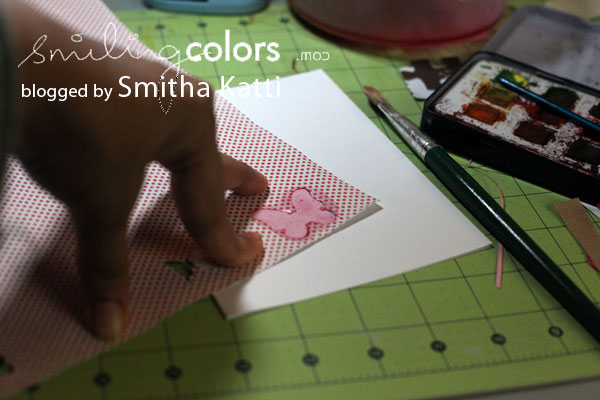
I cut the coffee pot, cup and saucer using the cartridge From My Kitchen. The cup is actually a tea cup on the cartridge but I simply folded under the base of the tea cup to make it look more like a coffee cup. The card was made by cutting ovals and creating an easel style card. The patterned papers are from Teresa Collins, and the sentiment is from K Andrew Designs, the butterflies were fluttering around in my box of embellishments.
I hope you enjoyed this little crafty coffee break. Visit my blog, Needful Things, if you would like to see some of my other creations.
Happy Crafting!
MelissaO
Thursday, April 26, 2012
oh baby baby
Quick and easy layout here... I used the other We R Memory Keepers Lucky 8 punch that I received for my birthday...this one creates a large circle shape and the punch is called Tatted Doily (it's my favorite). I love being able to create large, shaped, die-cut paper out of any paper I own. If you missed my first post about the other shape I have, click here.

There is a secret journaling tag behind the top photo, but that is still not my secret.
Here is the secret...the blue, pink, orange plaid paper that I used for my background frame. I didn't "waste" the whole sheet of paper as my background.
Here is my tip...
as you can see in this photo above, using a ruler, I framed out the edge of the paper (1 inch on all sides). I cut out the center square and just used the frame as my background. This way I still have a 10" x 10" sheet of this paper.
Here is what the layout looks like from the back.
Tuesday, April 24, 2012
Reminding Myself
It's only April and I am reminding myself the word that I chose for 2012: STILL.
Isn't it amazing how quickly we forget and/or get distracted? The easy out would be to just change my word but I know that wouldn't be the right thing to do. Nothing quite like committing to it, once again, than creating a layout with that reminder.
The past few months have been busy on all accounts. Some life changes going on and just business in general. It's easy to get caught up in it and get frazzled. Thankfully, I have the word on my wall so I am reminded constantly. It also fit perfectly to create something to remind myself using the April kit from Scrapbooking from the Inside Out - CONTENTMENT.
I went a little bit out of my style and comfort zone with this one. I find that I feel safe and cozy when my layouts are centered and linear or horizontal in nature. But this one, I wanted to try something just a little different. I think I was inspired by the patterns of the Teresa Collins papers and elements from the kit.
Not sure.
I like the symbolism of calmness that the banner creates. For some reason I picture laundry hanging outside, blowing gently in the breeze and a calmness hanging in the air.
Love those tickets from Jenni Bowlin! I wasn't quite sure how I would incorporate them but I just went with it. Filled in the blanks and turned it into a way to date the layout, balance the layout and complete the journaling.
So how are you doing with your word? Had to do any reminders yet?
Monday, April 23, 2012
Clean and simple (and quick) stamped card
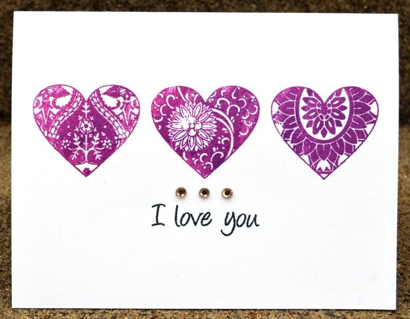
The hearts are from the new Joyful Hearts set and the 'I love you' is from the everyday occasions set. I used some clearsnap dye ink in a dark berry color to make the hearts really pop. A little bit of bling from My Mind's Eye finishes this card off perfectly.
Just a little tip - I lined the hearts up on the acrylic block and stamped them all at the same time so that I could be sure they were lined up perfectly. I probably should have added the sentiment at the same time, but I didn't think of that beforehand.
Saturday, April 21, 2012
A Spring Digi Freebie
You can download them here for the next week, then they will fly away....
Use them digitally or print them out and use them with your paper scrapping. Journal on them, make a butterfly banner or just embellish - the possibilities are endless! Enjoy.
Friday, April 20, 2012
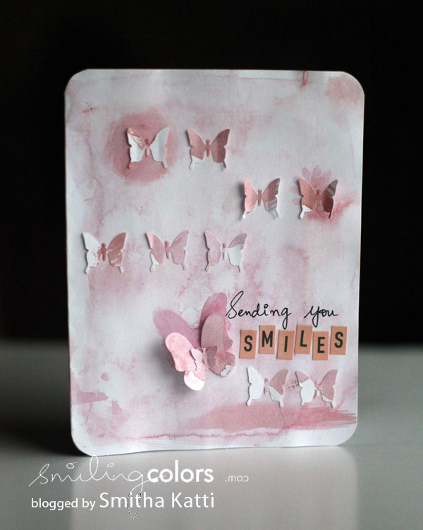
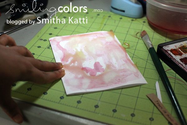
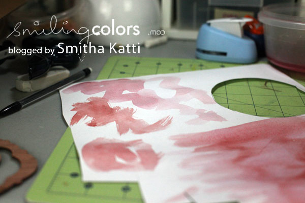
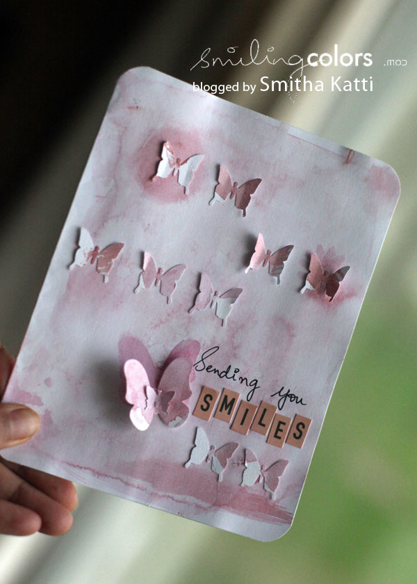
{watercolored butterflies}
Wednesday, April 18, 2012
Masking made easy!

 The first thing I did was place the template on my cardstock. Then I cover the areas outside of the templates with scraps so that when I spray the mist, it doesn't go all over the layout.

Once the areas were covered, I sprayed the mists onto the template. Be sure to spray several coats so the color is rich.
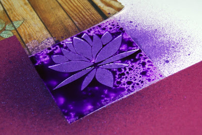
After I sprayed the pattern on my cardstock, I carefully removed all of the scraps and then I gently picked up the template and flipped the side with the mist in a different area on my layout. I used my paper piercer to rub the template to make sure I got all the mist off the template and onto the cardstock. I then gently removed the template and let it sit a few minutes. Then I layed a book on top of the cardstock to keep the cardstock from bulking up from all the mist.

And here is my final layout! I love this... even with all the purple :) (which is a color I rarely use).

Tuesday, April 17, 2012
Shape Up
Saturday, April 14, 2012
New Releases Coming Soon!!
In the meantime, I'm glad the virtual world offers an opportunity to keep up with the latest trends, techniques and hot new products. Scrapbook manufacturers have gotten really good at using the Web to not just share, but interact with its global customers. Facebook, YouTube, Twitter, company websites and blogs, message boards, paper crafting communities and, of course, digi magazines like ScrapStreet have opened up the world to us! We can share our work, comment on projects, enter challenges, contribute articles and so much more. We can also access a huge array of supplies made available for purchase online. You don't have to live in a big metropolis to get your scrap on anymore!
I have learned so many techniques from watching YouTube videos or reading tutorials online. I just Google "How to [fill in the blank]", and I usually find what I want on the first page. If I didn't have this virtual world, I don't think I would have been able to grow and hone my skills. I certainly wouldn't have all the awesome tools I have because I would have never heard of them. Copics? Silhouette Cameo? Crop-a-dile? What are those? Not only do I know what they are, I own them!! And if you have a limited budget, there are so many articles and tutorials that can really teach you how to stretch your crafting dollars!
I have a little confession. I have somewhat of an ulterior motive for this post about how helpful the Web is for paper crafters. I am also announcing a blog hop and live UStream event that takes place one week from today announcing new releases for Pink by Design Stamps, where I am honored to be on the design team. There are some really neat stamps coming out. I am super excited about it. During the hop, we will be sharing projects using the new releases. Later that day, at 9 p.m. CST, Sarah Hamer (owner of Pink by Design) will do a live webcast to show everyone all the fun new sets. You will have the opportunity to live chat with her and everyone else at the event. It's actually really fun. My husband even enjoys it and he doesn't scrapbook!! All the details will be listed on the Pink by Design site. I hope you can join us.
I really do think the paper craft world has evolved because of the Internet and I encourage you to take advantage of all the opportunities it has to offer, although if you're reading this post, you probably already are!! LOL!
Friday, April 13, 2012
Feeling lucky?
Is it worth it to be able to create all of these paper shapes from a few punches?...I think yes. Is it a good birthday surprise?...I think yes. I'd like to hear your review if you've tried the Lucky 8 punches, and do you have a favorite shape?
~Kelly
Thursday, April 12, 2012
Art folders again~
Wednesday, April 11, 2012
Spring is in the air!


Supplies:
Glitz Designs "Pretty in Pink" Patterned Paper
Glitz Designs "Pretty in Pink" Rhinestones
Glitz Designs "Pretty in Pink", "French Kiss" Cardstock Stickers
Glitz Designs "Pretty in Pink" Teeny alphas
Glitz Designs "Pretty in Pink" Glitzers
Glitz Designs "Pretty in Pink" Whatnots
Other:
Baker's Twine: Scrap Pantry (Esty)
Buttons: Epiphany Crafts
Word stickers: Cosmo Cricket
Die cut machine: Cricut
Cartridge: Stamp
Pearls: Zva Creative
Flower: Zva Creative
Pen: Adhesives: Creative Memories


