Friday, September 30, 2011

Happy October!

Leaves are a blowing, pumpkins are ripening, stores are filled with candy in delightful snack sizes--aahhh October.  This month we have double the treats--two magazine issues!

The Fall Issue of ScrapStreet.com Magazine is full of fabulous fall creations to inspire you!  We are thrilled to share a bit about our new writers with you in this issue in addition to articles by the writers you know and love.  Ready to settle in for a read?


And then the October Issue of GingerScrapsStreet Magazine brings you articles on costumes, farms, falling in love and more.  We have plenty of inspiration for digital, paper, and hybrid scrappers alike.


We have a very different kit for you for October! Full of bold color, arty and steampunk style elements and an unusual title! Wild Mood Swings was kindly created by Amanda Thorderson and is the sort of kit that makes your fingers itch to get creative. It challenges and inspires you to push your scrapping and artistic boundaries. Ideal for art journaling, ATC's, collage, masculine and even heritage projects, it is such an interesting, varied and richly colored kit. Let your mood swing a little on the wild side with this kit... 


Downloads:  {papers}  {elements}
Please respect this generous gift and do not upload/share this kit.  Friends are welcome to download it here for the next month.  Thank you!

Enjoy your October!

Back To School

It's end of September so I'm sure many of you have some cute back to school pics just waiting to be scrapped. So I thought I'd share a couple LO's I made using the adorable brand new ABC Primer collection by Graphic 45. I used the Paper Lovelies October Kit for these layouts.

Also, just wanted to let you guys know that I'm having a couple big giveaways for my recent birthday, and I'll be picking the two winners on 10/1 - for more info see HERE.

First up, "An ABC Primer"....yep, that's me!


And the second LO is DD on the first day of school a few weeks ago:


For this 2nd LO, I had to adjust the photo's colors in Picasa. The colors in the original photo were too bright and modern, so I had to "antique" it a bit...see:

Original:

Edited version:

Kind of cool, right? :)

Thursday, September 29, 2011

We All Scream For ...

ICE CREAM!!

It's an ice cream party!!! Put on your party hat and get ready for some sweet delights, friends, because I have a fun treat for you! You're all invited to my ice cream party ... well, my virtual ice cream party. It may not taste as good as a real one, but it's lactose, fat and calorie free!!

I've created two cards - an invitation and a thank you card - as well as two centerpieces. Now, this is where the party starts to get a little wild and crazy. I am going to share with you my first-ever paper crafting tutorial. Brace yourself while I show you how I made the centerpieces!!

Step 1: Cut out the pieces from your electronic die cutting machine. They should look like this:


Step 2: Fold the sundae dish at the perforated edges. Adhere mounting tape or other strong adhesive to the bottom flap:


Step 3: Stick flaps together so your sundae dish stands up like this:


Step 4: Glue the two bottom scoops to the sundae dish, one on each side. (Note: the bottom piece has one slit on the top. The middle piece will have a slit on top and bottom, while the top piece has only one slit on the bottom.)


Step 5: Build your sundae!!

Two Scoops!
Three Scoops!!


No party is complete without favors for your guests. I'm giving away the Silhouette Studio files for the centerpiece and the ice cream sundae on my blog for FREE!! Thanks for coming to the party! I hope you all had a fun time!!

Annette

Wednesday, September 28, 2011

The Art of Paper Piecing

My favorite things to create are mini albums, but once in awhile I get in the mood to make a cutesy page. I also have a grown daughter but I still have some “catching up” to do on her childhood photos. So what better way to make a cutesy (child themed) layout than to use some paper piecings.

I get my ideas for paper piecings in several ways. I buy coloring books, I go card browsing at my local card shop and I also get ideas from cartoons. There are also websites that will sell you a paper piecing pattern in an svg file to load onto your computer for your cutting machine. You can also get a light box, especially if you are using a cute image from a coloring book.  I personally prefer to make my own paper piecings - so I draw them.

All you have to remember when making paper piecings is to“pull apart” your image. For instance when I drew this bear (got the idea from a card I saw), I first drew my bear, then I copied the image on the Xerox several times.  Then I cut the image apart by first cutting out the head, then I cut out the muzzle, then the nose, then arms, etc. I did the same thing with the bunny head.


Here are some other paper piecings that I have drawn. All my drawings are very simple, but that is all it takes. Remember It’s all in the details, by layering, inking and embellishing your paper pieces - you can give them character.


With this owl, I “textured” its head and wings by running them through a cuttlebug embossing folder. Then I made the feathers by punching out several rows of a fiskars border punch and “layering” them one on top of the other.
My next paper piecing is this mermaid I originally made for an underwater layout class I taught. My thought was that it would be cute for a little girl’s pool party or for a Halloween “little mermaid” costume layout.


With this mermaid, I “layered” her hair, and then I made her scales by layering circles in rows.

Then to give the mermaid that "wow",  I added lots of bling.

So next time you are stuck for an idea for a layout - go buy a coloring book and get some ideas for a paper piecing layout. Enjoy.

Tuesday, September 27, 2011

You can't mail that. Can you?

by Melissa Oeters

I hear this often because for the last year or so I have become a card making addict.  Friends stop by and I’m sticking my latest cards in their face to prove that I do more than eat bon bons all day.  I’m certainly not alone in card making, there are a ton of us out there.   The cards I make are fairly embellished, but I’ve seen cards with flowers and embellishments so large they would never fit in an envelope.  Even using your long lost shoe horn and managing to squeeze the card in the envelope it would end up being smashed while it was tossed around in the mail bag.
But you can still make embellished cards, you just have to be aware of how thick or how fragile the item is you are using.    I make my cards to be mailed so I tend to lean toward soft flowers, stickers and diecuts.  Plus I use a lot of adhesive pop dots so I can get a dimensional look that can be flattened a bit when it’s in the mail and still come to life out of the envelope.   I try to keep in mind that a card is conveying a message from me to you.  I want to be sure the message is clear without your needing pruning shears to get to it.


Monday, September 26, 2011

Love flowers and mist

 Hi all. Gudrun here.

Today I wanted to share my love for flowers and glimmer mist.
It is starting to be fall-like here in Oslo, the capital of Norway, but as I am a real summer person I won't let the flowers and sun go.
I use the rainy autumn days to create some colorful, fun flower projects.
And capture my summer memories.

The layout has white cardstock as a base, and the colorful flowers are mostly based on white paperflowers and mist.
I had SO much fun doing this projects, I wanted to share a little "how to" for you to get inspired.

I started out with a bunch of old, white paper flowers and lots of  mists in different colors and brands.

I colored all the flowers, sprayed them in the rainbow colors, and made little drops and tone-on tone misting on each flower to make them more "real".
When finished I let them dry on a piece of newspaper - to make sure I didn't make any mess any place.


I added the flower to my layout and arranged them with other fabric and paper flowers, brads and bling to make a pretty, "summery" layout.

Thanks for joining me.
And happy fall!


Saturday, September 24, 2011

Be-Witching

Where do you go when you've lost it?  The mojo that is.  Sometimes I just seem to move things around and re-arrange my crafty stuff so that I can trick myself into thinking that I haven't lost it.  The mojo that is. 

Last year I bought this Halloween banner kit from The Scrappy Gourmet.  Apparently it was just waiting for me to crack it open when I needed it the most.  Maybe I just don't want to admit that it's fall.  Fall is my FAVORITE season, but it also reminds me that we are headed toward winter (NOT my favorite season).  This kit is just what I needed to make me want to embrace this time.  While I was working on it, I started getting this feeling.  It was warm and fuzzy and kind of made my head hurt.  I think it was some mojo returning!  I started pulling out paper, making my fingers inky, and writing things down!  That's how fast the ideas were coming!  You might even see more than 1 blog post per week (maybe I shouldn't get carried away).


Back to this kit...it's called "The Witching Hour", by Sheila Rumney.  Since this is the first kit I've bought from The Scrappy Gourmet, I have nothing to compare it to, but this one was FULL of texture, graphics, ribbons, brads, and chipboard.  I had to paint, ink, punch, glitter, and sand.  There were so many steps, that this kept me busy for a few nights.  I give it two inky thumbs up!

Friday, September 23, 2011

Take Something Old and Refresh It

Hi, Veronica Johnson here, and I am one of the new writers on Scrapstreet.  I wanted to talk about some of your old stash today.

The Holidays are just around the corner, so why not get an early start?  You can begin by making some embellishments for Halloween since there are only a couple of days left in September.   I started rummaging through my box of Halloween embellishments (I organize by theme) and saw these two “VERY OLD” die cuts.  I don’t even remember where I got them, that’s how old they are.  But, I love a challenge, so I went from this:


 To this by “refreshing” my old die cuts by inking, adding cutesy brads and ribbon. 


My next challenge was what to do with this plain non-descript sack die cut?


What to do?  I could have inked it and added some ribbon, but still it would have looked pretty plain.  So I decided to revamp the old shaker box idea, remember that?  Shaker boxes were more popular several years ago, so why not kill two birds with one candy sack?

I cut out a square in the middle of the die cut, and then I added a square piece of plastic I got from an embellishment package.  Next I added some beads to put into the square to make the beads look like candy.   It was that easy to make a shaker box!


I also “prepare” my embellishments by layering them to a piece of cardstock or pattern paper.  By doing this I create a sort of “border” so that I can glue down the ready-made embellishment to a layout or album.  Voila! I am ready for at least a two page layout, and I feel good about the fact that I used some of my old stash!

Thursday, September 22, 2011

Inspired by Dora~

Hi everyone~ I wanted to share with you some cards that I made using, the fabulous, Kraft cardstock.  I first saw a post on here, with fantastic examples ~ so Dora , this is for you.  Your cards were amazing!!!


I used the same supplies on all of these cards. I got my scrap bag out of Jenni Bowlin pattern papers, my new Jenni Bowlin acrylic stamps and some embellishments!!  Kraft cardstock is so user friendly and in my opinion, you just can't mess it up!  Have a great day and see ya soon!  by: C. Mercer

Tuesday, September 20, 2011

Masculine Anniverary Card

Hello everyone! I am so honored to be one of the new writers at ScrapStreet. This is my first blog post! Yippee!! It's a special day - not just because I get to share my creation with you for the first time (although I'm pretty excited about this.) It's special because eight years ago today I got a chance to share my life with my husband in front of God and more than 200 of our closest friends. Yes, my new friends, it's our eight-year anniversary. Sometimes I can't believe it's been eight years. Two kids and several gray hairs later, John and I are still as committed to each other as we were on that beautiful (last day of) summer afternoon.

I am sharing with you a card I made for John. It's a masculine anniversary card. I have to confess, I struggle with masculine cards, just like many card makers. I am a girly girl who likes pink, pretty flowers, shiny ribbon, delicate lace and lots of bling!! As I was making this card, I was thinking about what colors and embellishments to use. Then, it donned on me. Masculine cards are really not that different from non-masculine cards (a.k.a. feminine cards.)

The formula is pretty much the same. You still want to balance your image, take advantage of white space, use colors and patterns that complement each other, etc ... You can still keep your style, just change some of the elements. Use neutral colors and stick to images and embellishments that are more "masculine." If you like to use ribbon, use twine or hemp instead. If gems are your thing, substitute them for buttons. Instead of flowers, use leaves.

For John's card, I chose a very neutral palette. I added just a touch of red (because it is supposed to be romantic after all!) I created the image on my Silhouette die cutting machine. I used numbers (our anniversary date and number of years married) as the focal image. Numbers seemed appropriate for this card. They are neutral and my hubby is a computer nerd. (John, if you're reading this, I love you, honey, but you're a little nerdy.) I created the sentiment on the computer. Instead of flowers and flourishes, I stuck to a few simple hearts. Buttons and hemp twine give this card the finishing touches.

I really like the final product, and I know my husband will enjoy it, too. Although, in all honesty, I could draw a couple stick figures with a pencil on some wrinkled scrap paper and he would still love it, but I wouldn't do that to him. He's worth the extra special effort. :-)

Monday, September 19, 2011

we have a winner!

Thank you all for joining in to celebrate our anniversary with us!  We loved reading all of your well wishes.

We used random.org to find our winner:


and the 11th comment is:


So, Jingle you are the winner of our big happy prize!  Please send me a note to dora at scrapstreet.com and put Anniversary Winner in the subject line.  I will be so excited to send out your prize!

A big thanks to all for partying with us!

capture the season...


Hello everybody! I am so happy to have this chance to meet you all! My name is Smitha and I am a brand new staff writer at Scrapstreet.com. Hopefully, you will be seeing a lot more of me around here...

Out where I live, the season is changing... Fall is in the air, and this just might be my new favorite season- not too hot, not to cold... 

Today's layout is all about the colors of fall. I love photographing seasonal items- like the pumpkins, the flowers and the trees. I have echoed the fall colors in my patterned paper choice here. In this layout I have lined up my papers and photographs and kept simple, clean lines but the colors are bright and catch your eye.

If there is one thing that can be found in abundance in every scrapbooker' stash - it is patterned paper. We tend to accumulate piles and piles of these, atleast I sure do. So for your next layout, try this, make a layout using only patterned paper- no embellishments. Mix and match as many papers you can and see what you can create!

If you do take this challenge, leave a link for me in the comments section so I can come by your blog and say hi!

Saturday, September 17, 2011

Monster Love Notes


Howdy...I'm Kelly, one of the new writers for Scrapstreet.  Eeek!  I'm excited!  I'm so excited, I'm doing a "Monster Mash"!

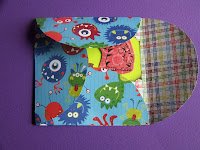
Once in a while,  I remember to stick a quick love note in my kids' lunches.  Once in a great while (like when the planets are aligned) I make a cute, scrappy note to stick in their lunches.  Well, get ready for an eclipse, because today, lunch note love was high on my priority list.  And, I had promised some friends that I would show them how to make these cute cards that fold up like a box. 
Make a template (I used a cereal box) of a 4 1/2 diameter circle and a 4 1/2 inch square.  Fold the circle into exactly two equal parts.  Using these templates, trace them onto a sheet of patterned paper.  I traced with a black marker to show you, but you'll want to use light pencil lines.  Then, cut out your pattern, and fold on the pencil lines.
I stamped and cut out these adorable monsters from Close to My Heart to carry my lunch thoughts.  Fiskars scalloped squeeze punches (I used Cameo Appearance) make great "bites" out of a cookie.  Now it is time to creatively fold...
Bottoms up...


then fold the left flap over the bottom...
the top flap over the left...
and tuck the lower part of the right flap into the bottom. 

If you seal the top and write an address on the back, you can send these in the mail without an envelope!  Mine are going via lunch mail.


So, my kids may like that they received a love note in their lunch.  They may not like that the monster ate their cookies!

Supplies: Paper: Reminisce, My Mind's Eye, Close to My Heart, The Paper Studio, Stamp: Close to My Heart, Tools: Squeeze Punch: Fiskars