Sunday, September 30, 2012

Welcome to Fall

It is officially here in the midwest.  Even though the temperatures are still a balmy 75 by day, the nights are cooler and the leaves are beginning to change.  I absolutely love the deep colors that paint the woods near my home.  It is such a fun time of year to be a mom--so many activities, so much fun!

As much as I love this time of year, this blog post is one that is bittersweet for me. 

On September 15th, 2005, I opened the doors to Scrapstreet. The online scrapping world was so very different then. Only a few companies existed selling items and offering communities. Digital scrapbooking was new and not yet mainstream. Blogs were few and far between. When we launched our ezine that December, it was a novel idea and embraced quickly-especially since we were free. 

Over the next 7 years, we grew and changed with the industry. Some of our writers moved on to other scrapbooking companies redefining success for themselves. Others retired from scrapping to pursue other interests or family commitments. Some stopped writing, but stayed to help and cheer from the sidelines. Many achieved other scrapping goals while staying with us embracing Scrapstreet as a home base. 

We branched out into hybrid, digital, cards, altered, while still offering tons of traditional paper layouts. We worked with products and created for pretty much every company selling and were always proud of the results. In fact, we outlasted many of the companies we loved. We never missed a month (even when there were some close calls!) and for long stretches of time offered two magazines a month. 

All told, December will be our 100th issue. 

And our last.

I hope that all of you will join us in celebrating our wonderful years together.  Our request is a simple one--please submit a layout that you would love to have in our final issue.  Share with us your favorite work and be a part of our final goodbye.  We would be honored to share final step in this journey with you.

Here we are in our final countdown with a fabulous Fall issue to inspire you.


This month our free kit is from the absolutely amazing Kathryn Estry from Kathryn's Digital Designs.  Kathryn creates classic digital kits with lots of elements perfect for capturing all of your favorite family moments.  You can see more of her gorgeous work on her blog along with updates on her specials. 


Downloads   {paper}  {elements}
Please respect this generous gift and do not upload/share this kit.  Friends are welcome to download it here for the next month.  Thank you!

I look forward to seeing your submissions for our final issue.  Please check out the details HERE.

With love!  Dora

Thursday, September 27, 2012

Liars

Hello everyone! I just wanted to share a quick layout of mine using the September Innocence kit by Scrapbooking from the inside out. This month was a bit deep for me... I decided to create some layouts based on some of my childhood memories; these memories were'nt so innocent... I think it's important to share the hard/scary times in your life because you never know; there might be someone else out there suffering from similar memories... and it may be comforting for others to know that they're not alone and time does heal!

Wednesday, September 26, 2012

Multi Media altered notebook

Lately I have been really into mixed media. I guess it is a trend now and I'm not the only one. Nevertheless, I thought I would share a mixed media project with you.

This is a notebook that I got for a quarter at a back to school sale. I covered it in a couple layers of Gesso, then pressed the crackle molding mat into it. After that I sprayed it with the new Stephanie Barnard Dye ink in Banana, then ran the Banana ink pad over the texture for a little more definition. The muslin was hand cut and then stamped with the Rollograph and three colors of stephanie Barnard dye ink. The chipboard was gesso'd then sprayed with Dye ink in Orange, then inked with some brown chalk ink. The trims are Hydrangea Hippo.

I have also been using modeling paste. The texture on the background probably would have worked better with that, but I didn't have it at the time. It's thicker than gesso and holds texture and design well. I have been using it with stencils to create an embossed look.


Wednesday, September 19, 2012

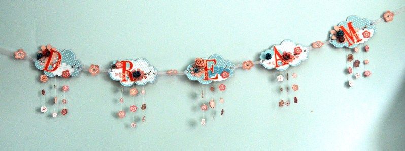
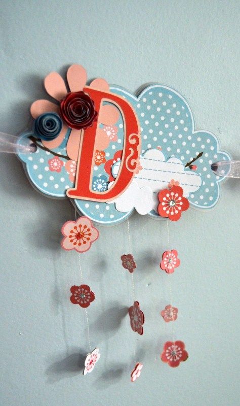
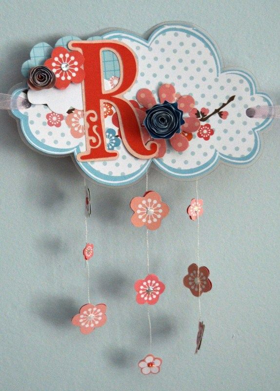
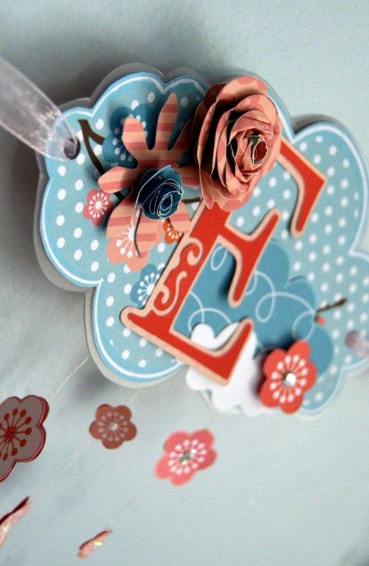
Banner using cutting boards

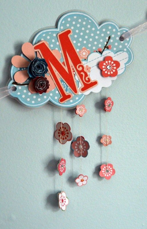
Today I thought I would share this banner that I created using flexible plastic cutting boards from the dollar store as the base.

I  also used the Aiko line from My little Shoebox.  I wanted the feel of this banner to reflect the theme, so I made the strings of cherry blossoms hanging whimsically like rain drops. A little bit of shine adds to the whimsy.check out my blog for more info.


Tuesday, September 18, 2012

Going hybrid

Hello ladies. Nicole here with a few hybrid layouts! I wanted to step out of my comfort zone a little bit this month so I decided to dabble a bit with elements from Glitz Designs digital kits! While scrapping, I decided that it was quite fun and so easy! I simply printed some digital elements on white cardstock and cut them out with scissors. Here are both of my layouts using digital embellishments! You can hardly tell the difference from paper vs. digital. I love them both and hope that you are inspired to try Glitz Designs digital kits!
Supplies used: Glitz Design: Patterned papers (Afternoon Muse, Pretty in Pink) Glitz Design: Digital elements from the Happy Travels Paper Kit. Other: Ribbon (leaves): May Arts Flower: Zva Creative Jewels: Zva Creative Paint: Tattered Angels Spray mist: Clearsnap Pen: Creative Memories Corner rounder: Creative Memories Adhesives: Creative Memories
Supplies used: Glitz Design: Patterned papers (French Kiss, Pretty in Pink). Digital embellishments from the Pretty in Pink Collection. Other: Patterned transparency: Hambly Ribbon (leaf): May Arts Burlap: May Arts Flower: Zva Creative Pearls: Zva Creative Spray mist: Clearsnap Corner rounder: Creative Memories Butterfly punch: Jenni Bowlin Adhesives: Creative Memories Thanks for visiting today. Hope you have a fantastic day!

Monday, September 17, 2012

Coloring outside the lines

 
Do you have a rebellious side? 
Me, not so much. 
You'll never find me on a bungee jump. 
I don't have a need for speed. 
While I'm sure the view and the experience is fantastic, I won't be booking any trips to Nepal to climb Mt. Everest. 

While others may live for adventure, I let my wild side out while I'm creating. Now, I don't go crazy and shoot color out of a paint gun, roll around with my body covered in paint,  or throw knives at paint filled, suspended balloons. 
 
But sometimes, it's nice to break the rules a little bit.
 
So for these cards, I stamped these images in black (the large botanical image is from Kaisercraft, the sentiments are from Hampton Art), and rather than color them in, I mixed a little water with some colored ink and splattered. Drip, drip, drop!
 
 
Now, a kindergarten teacher might encourage you to color in the lines, but me--I'm a paper art rebel.  I say "Go for it"!
 
Look for more watercolor techniques in the next issue of Scrapstreet that will be posted on October 1st. 
I'd love to see your watercolor rebellious side!
 

Friday, September 7, 2012

Sometimes it's all about quick and easy


Sometimes the fastest way to a scrapbook page is with a collection. I am not one to remember the names of paper patterns or if I bought stickers that match the patterned paper, but this time, I remember! One, because I LOVE it, and TWO, because I just bought it recently. A trip to Archivers had me roaming the aisles looking for something I could use with this Florida photo of my little girl and her sand ball. BING! I found it with this "Splash" collection from Little Yellow Bicycle.
I bought the paper and the "clear cuts" embellishments to make this page go together so quick and easy. Sometimes, when I look at my stacks of photos that I want to scrap, I'm all about quick and easy. Archivers had this flower punch that reminded me of starfish (although, my children have told me that starfish are now called "sea stars" because they are not really a fish). So, I punched a bunch of those out of some brown kraft and metallic gold papers, and used sand paper for my title (sniped that from my husband's tool box). I'm going to give a little shout out to Glue Dots too--they are invisible behind those LYB clear cuts--how awesome!
I didn't feel like this page needed anything else.
I love the page. I love the sand ball. I love the photo.
And, I love that little girl.


Pin It


Sunday, September 2, 2012

Eraser Tool Tip

Do you spend hours and hours creating a digital layout?  Or, are you able to pump out multiple pages a day?  For me, it truly depends on how the creative juices are flowing at the time.  
I have however, found a few tricks that I think are great time savers, and I wanted to share one of them with you today.
My goal in the example below, is to make it appear that the red flower element is fed through the hole on the top of the tag, and that the blue string is woven on top of, and under the elements.  Rather than spend a lot of time erasing the elements "just so", I'm going to do some duplicate layering and THEN erase portions of the layers.
I'm going to duplicate the tag and make the duplicated layer the bottom-most layer (keeping it in the exact same position on the page the top layer is in)


Looks a lot like step one, doesn't it?  Trust me, the duplicated tag is on the bottom.  :-)

Now I'm going to go back to the top layer of the tab and simply erase a portion of the tab so that the stem of the flower shows through.

I'm going to repeat that process with the string - duplicating it and moving the duplicated layer to the bottom.  Then I'm going to go back to the top string layer and erase portions of it.

After erasing parts of the string, it looks like it is woven on top of and under the flower stems and leaves - and is woven through the hole of the tag.

The final step is to add drop shadows. I've added a shadow to the tab and the string - {Be sure to add shadows to the duplicated (bottom) layer first.}

As you can see in the above example, the tag looks fine, but I need to add a shadow to the string that is on top of the tag (which is the top layer of string).


There!  Finished! 

It may take a little practice, but once you catch on to this little trick, I hope you love it and find that it does save you time! 


The above was done using Corel PSP X4.  Here are a few pages I've created using these same steps:


Thanks for stopping by and Happy Scrapping!!

Jill